P.s I Love You

P.s I Love You is presented in a font style that is similiar to handwritting, this would give the impression that it would have been written, coinsiding with the theme that he leaves her love notes throughout the film. The colour red is often recognised through it's negative ideolody of danger and death. however, in this case it gives the connotations for passion and love in order to suit the romantic genre of the film. this is something we should take into consideration when creating a title that represents our romantic genre based opening.
SAW 3

The SAW 3 title is appropriate to the genre of horror, and the "3" is represented by the violent, unpleasant image of 3 teeth dangling from a string. with this you are given the suggestion that these teeth have been ripped out, thus creating the idea of pain and torture that occurrs within the rest of the film. the colour scheme here is also very dull and dark, highlighting the grim nature of the storyline.
Ideas For Our Title
Whilst thinking of titles, me and my group each produced a document containing the name of our film, "The Dearly Departed", written in different styles of font in order to experiment and then compare. we will now discuss which we feel best suits our film opening..
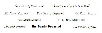 Personally, as our film is a romance, i think a more femanine style font would be appropriate. however, a block printed style would have more impact, suggesting the drama and tragedy within the genre.
No comments:
Post a Comment