Monday, 10 May 2010
Thursday, 8 April 2010
Ratings
 To establish what kind of rating to give our film i've looked at criteria for allocating specific ratings from official and reliable websites to make sure the rating i think best fits my film is more realistic and trustworthy.
 Also i have researched into the age certificates given to other popular romance films to compare, as our rating would probably be of a similar scope.
Titanic - 12
The Notebook - 15
P.s I Love You - 12a
http://www.bbfc.co.uk/downloads/pub/Guidelines/BBFC%20Classification%20Guidelines%202009.pdf
 This is a link from the British Board of Film Classification website which looks at age certificates in more detail. looking at which, i feel a label of 15 would be most suitable for our film as strong language may be used throughout the rest of the film as with the use of such language, it makes it more realistic and loyal to the portrayal of adults who are likely to use such words in every day life; in an arguement to express aggression, or even to express intense enjoyment.
The element of violence in the beginning suggests that further violence may also be featured within the film to uncover the more sinister aspect to our storyline, though we would not be yet able to specifiy the level of violence used, it would be safer to give it a higher rating just in case we would decide to elaborate on the tragedy within our romance film.
Wedding Scene
We filmed for the wedding scene a few weeks back, and have now fully completed editing and applied the appropriate music by Josh Woodward - No Letting Go.
We have selected the chorus part of the music to be playing over this scene as the tune is slow and melodic, reflecting the mood we want to create, and also lyrics coinside with the female character's feelings of grief dealing with the death of her husband. i think that this choice of music played over the remeniscent scene's of their wedding might help to evoke emoition within the audience as they empathise with how the character is feeling.
I feel that this scene was key as it needed to have most impact on the audience. at first, the audience has no connection with either of the characters who are both in predicaments of unhappiness, and so they sympathise, but cannot show empathy for them. therefore i think that this scene is relied upon to begin to build up an idea of their relationship as a couple - appearing in love and smitten, allowing the audience to finally recognise the damage caused from the first scene, then link it to the second scene where after his death, she is crying and alone. and will be able to relate to the female character on a deeper level.
I think with the combination of appropriate music, it does so more effectively.
the dramatic contrast between the first two scene's where the two characters are seperated, alone, and in situations of distress to the final scene of the opening where they are happy and together also helps to have more impact on the audience in terms of how they recieve it. also, the pace alters through out each scene so far thus making it more interesting to view.
We also decided that the use of extras for this scene was not neccessary. at first we intended to have a crowd surrounding the happy couple to represent friends and family, but, for convinience and to create a more intimate setting, we decided to only show the two of them together, and have them laughing and joking with us behind the scene to give the appearence of them conversing with the guests, but still maintain the idea of closeness.
In addition, we added an effect onto these scene shots which gives it an aged appearence. the camera movement is somewhat unsteady as to give the idea it is handheld and being filmed by a guest at their wedding. the effect is also like a recording, and so reinforced the notion that is was filmed by someone - we are thinking about getting some sort of time-stamp and "rec" sign often assosciated with handheld video camera to emphasise this. the aged appearence to it also suggests that the audience are looking back on a past time.
Monday, 22 February 2010
Filming Update - Incident Scene
Since my last update we have made significant progess in terms of filming. We have now completed the filming and editiing for the first 50 seconds of our opening, the "incident" scene.
and are now ready to continue filming the remainder of the opening.
Also, a change of plot was necessary as we were unable to rely on the extras that we wanted to involve in this scene. we instead set the scene in a near by park with the male character on his own. this was actually an advantage as it made filming a lot easier to direct, also as were working within a tight time-frame around the actors prior responsibilites elsewhere, so it was quick and executed smoothly, but maintained a high standard. despite the sudden change of plot i am very pleased with the outcome as i feel it works well, and would over-all make a more interesting storyline for our film.
To show an aspect of violence we used fake blood and applied it to the actors shirt. this gives the suggestion that he has been injured (possibly a stab wound, or gun shot). we have decided to put this scene first as it jumps immediately into the action, it is fast paced - capturing their attention instantly, and ambigious - leaving the audience wondering who this man is, what he is doing in the woods, and and what happened to him. i think this effectively sets up for the rest of the film where it would continue to reveal the series of events which lead up to this moment.
We have taken shots of him running in the woods from his perspective, this puts the audience in his shoes and lets them see from his point of view. we added an effect on these parts which makes the vision obscure and disturbed, suggesting that he is quite disorientated and confused.
We deliberately decided to only use digetic sounds in this scene, which is the sound of him running, branches cracking and breaking, and heavy breathing. this forces the audience to only focus on him and the action within the scene. the heavy breathing emphasises his exhaustion and feelings of desperation.
We now plan to film the wedding scene and complete editing for it on the upcoming weekend, Saturady 20th and Sunday 21st.
We are fully prepared for this, as we have all props needed - wedding dress being the most important. and have confirmation that both male and female lead will be available for filming on that date.
meanwhile, we will carry on with our project evaluation.
Monday, 4 January 2010
Film Titles
We are now thinking about planning the title credits for our media text. For this we have to take into consideration the font, size and colour. to get an idea of what kind of title screen we should apply to our production to coinside appropriately to the genre, i have analysed the titles of other films and how they use their title to represent the storyline..


 Personally, as our film is a romance, i think a more femanine style font would be appropriate. however, a block printed style would have more impact, suggesting the drama and tragedy within the genre.
P.s I Love You

P.s I Love You is presented in a font style that is similiar to handwritting, this would give the impression that it would have been written, coinsiding with the theme that he leaves her love notes throughout the film. The colour red is often recognised through it's negative ideolody of danger and death. however, in this case it gives the connotations for passion and love in order to suit the romantic genre of the film. this is something we should take into consideration when creating a title that represents our romantic genre based opening.
SAW 3

The SAW 3 title is appropriate to the genre of horror, and the "3" is represented by the violent, unpleasant image of 3 teeth dangling from a string. with this you are given the suggestion that these teeth have been ripped out, thus creating the idea of pain and torture that occurrs within the rest of the film. the colour scheme here is also very dull and dark, highlighting the grim nature of the storyline.
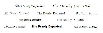
Ideas For Our Title
Whilst thinking of titles, me and my group each produced a document containing the name of our film, "The Dearly Departed", written in different styles of font in order to experiment and then compare. we will now discuss which we feel best suits our film opening..
Personally, as our film is a romance, i think a more femanine style font would be appropriate. however, a block printed style would have more impact, suggesting the drama and tragedy within the genre.Christmas Break
During this 2 week holiday period we intended to film he "incident" scene on the Friday we broke up, however, there were unexpected weather conditions. the floor had iced over, due to the snow, and so we thought it would be hazardous and unideal to film our cast running up the stairs as they would be very slippery.
We also didnt manage to get any filming done for the other scene's as we had forgotten a vital piece of equiptment, the tripod. the lack of this would make our project look unprofessional and with this being a key scene, the standard of it would need to be high in keeping with our expectations for our opening as a whole.
the letter we had produced for all cast members will be alterred and re used with the appropriate dates that we intend to next carry out any filming.
Subscribe to:
Posts (Atom)